The brief
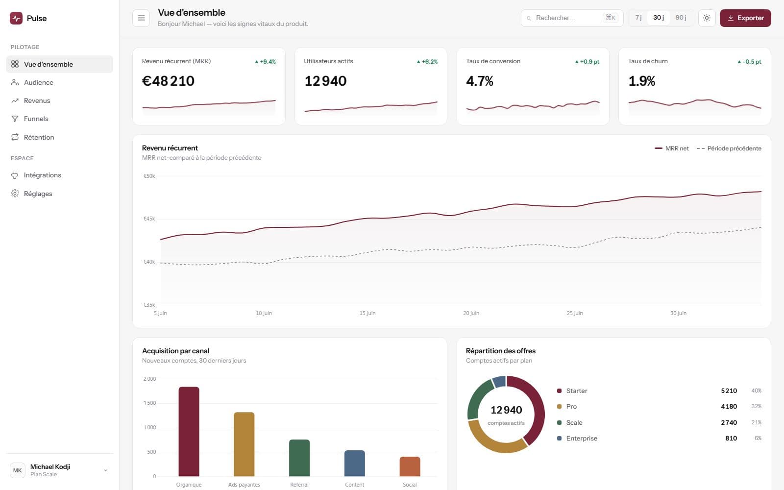
A product analytics dashboard for a subscription business. The problem with a tool like this is never the data: it is that there is too much of it. Recurring revenue, active accounts, conversion rate, churn, acquisition by channel, plan breakdown — everything matters, and so nothing does.
The commission was about the interface: making legible on one screen what is usually read across five tabs.
The constraints
- High density, owned. Someone opening their dashboard wants to see everything, not to click.
- No colour may carry information on its own: a chart read by someone with colour blindness has to stay legible.
- The figures change all the time: the layout must not move when a value goes from 3 to 4 digits.
The decisions
Two levels of navigation, not six.
Everything sits under two entries: Steering — overview, audience, revenue, funnels, retention — and Workspace — integrations, settings. The distinction is not thematic, it is temporal: what you look at every day, and what you set once. That separation alone removes half the back-and-forth.
The time filter above everything.
Seven, thirty or ninety days: a single selector at the top of the page drives every view. A per-card filter would have allowed impossible comparisons — revenue over thirty days next to churn over seven.
Tabular figures everywhere.
Every value is set in fixed width. A column of amounts aligns on the decimal separator, and a refreshing counter no longer makes the layout jump. It is a three-line styling detail that changes how solid the tool feels.
The result
An overview that fits on one screen: net recurring revenue with period comparison, active accounts, conversion, churn, acquisition by channel and plan breakdown. The accounts table is sortable, the data exportable, the activity visible live.
What I would do differently
An alert is missing. A dashboard you have to remember to open only serves you on the days you remember it: the next piece of work would be a configurable threshold on churn, notified by email. The data is already there; it is the use that is missing.