Loading
Back to projects
Test project2026-01
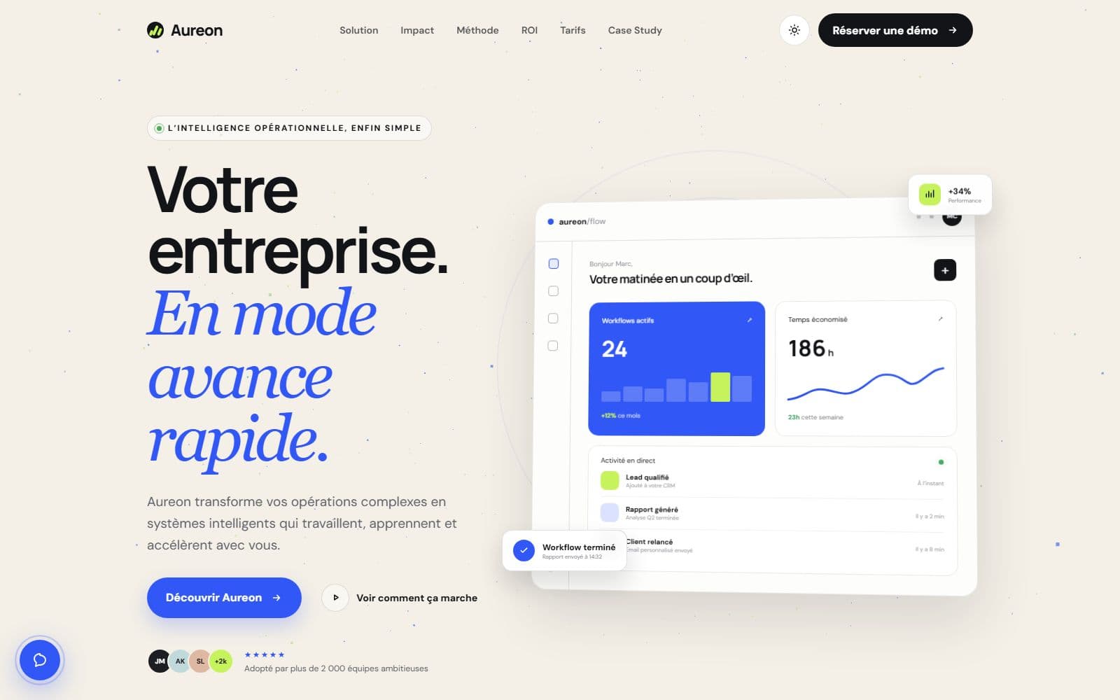
Aureon — Intelligent automation platform
A complete SaaS landing page for an operational intelligence platform: interactive ROI simulator, three-tier pricing, deployment methodology and FAQ.
aureon-umber.vercel.app
Context
Aureon presents a business-process automation platform: connection of 120+ tools (CRM, ERP, Slack, Salesforce…), contextual AI that learns the company's rules, first systems deployed within five business days.
Goals
- Sell a complex product with a crystal-clear message
- Provide tangible proof: impact metrics, a three-step methodology, a ROI simulator
- A page so fast it becomes an argument in itself (Lighthouse 100)
Solution
A landing page structured like a funnel: value proposition, four key capabilities, proof and testimonials, methodology, interactive ROI simulator, pricing (Starter / Pro / Enterprise), FAQ, strategic consultation. Every section answers an objection.
- ROI simulator — the user estimates their time and cost savings live
- Transparent pricing — three tiers with a monthly/annual toggle
- Trust — GDPR/SOC 2 compliance, AES-256 encryption, EU hosting highlighted
Stack
- Frontend: Next.js + TypeScript, Motion animations
- Performance: Lighthouse score of 100, optimized images
- Hosting: Vercel
Next project
ÌTÌ