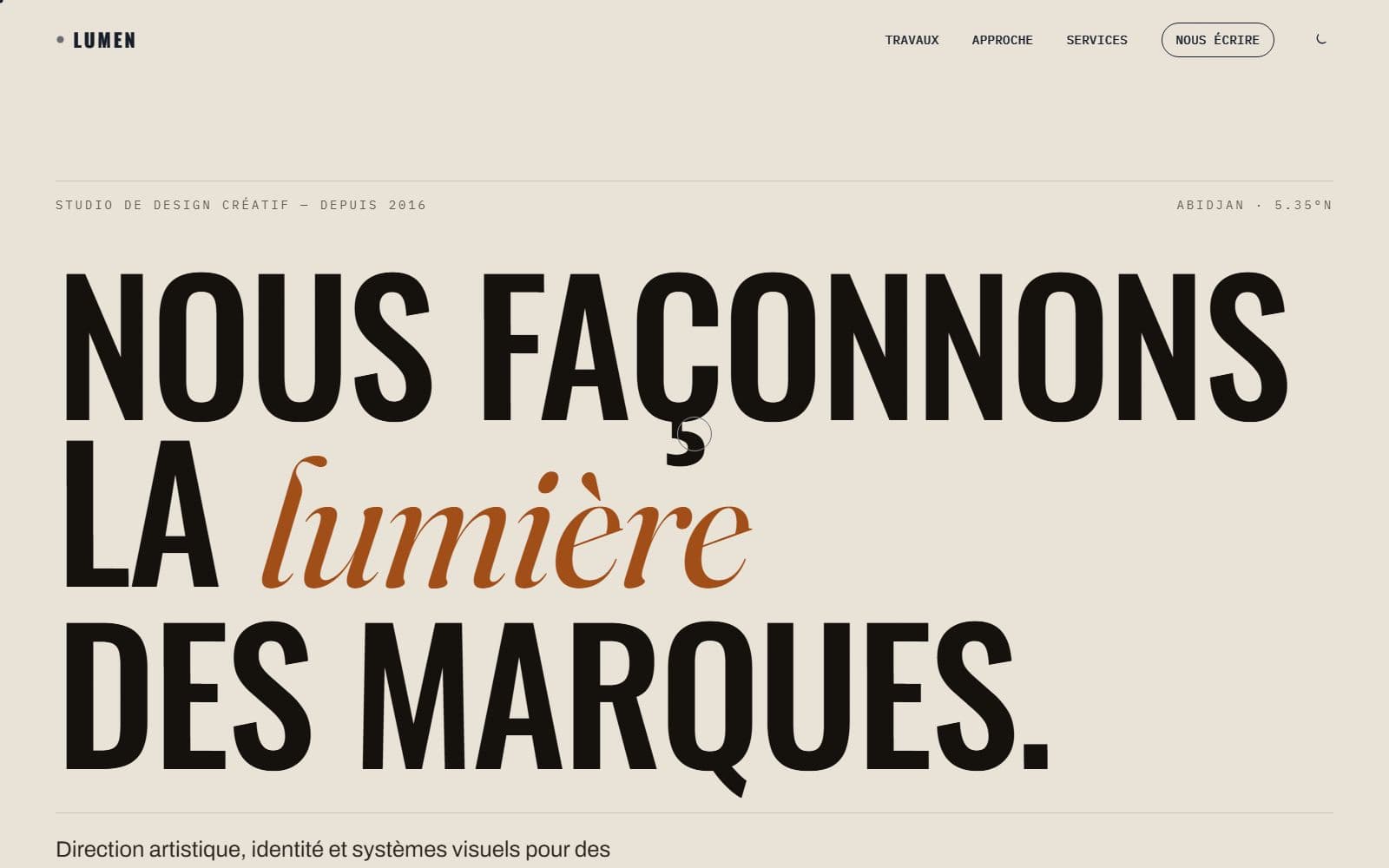
The brief
An art direction studio that sells its eye. On that ground, the website is not a sales aid: it is the first piece in the portfolio. If it is ordinary, it cancels out everything the studio claims.
The studio covers four fields — identity, art direction, motion and sound, interactive web — and six works. The risk was piling it all up.
The constraints
- The site is judged before the projects are. One clumsy layout and the visitor stops opening anything.
- Six works, four disciplines: enough to saturate a home page.
- No image may be cropped: to an art director, a damaged frame is professional malpractice.
The decisions
An index, not a gallery.
The six works are a list, not a grid of thumbnails. The title carries; the image is revealed on hover. Visitors first move through names — Halo, Terrain Vague, Onde, Sédiment, Cinabre, Veine — and choose. A grid of six images forces six simultaneous decisions; a list forces one at a time.
The approach before the services.
The page says how the studio works before it says what it sells. On creative work, the method is the product: a client buying an identity is above all buying a way of deciding. The four disciplines come afterwards, as consequences.
Constraint presented as material.
The studio's own argument is that constraint does the work, and the site stages it: a single type family, no accent colour outside the visuals, a single column width. The site demonstrates the thesis it states.
The result
A home page that holds in four movements — baseline, works, approach, services — and six case studies reachable in one gesture. Not a single cropped image: every visual is served in its original proportions.
What I would do differently
Hover carries the entire discovery of the projects. On mobile it does not exist — the index becomes a list of titles without images. I would design the touch version first, with one visible plate per project, and keep hover as a desktop refinement.