Loading
Back to projects
Test project2026-07
Lueur — Botanical cosmetics landing page
A landing page for a natural skincare brand: editorial art direction, product design and a real checkout flow (cart + checkout), all in Astro — static and lightning-fast.
lueur-cosmetique.vercel.app
Context
Lueur is a concept brand, built entirely from scratch as a demonstration project. The goal: to step out of my usual register — SaaS, dashboards, dark interfaces — and prove that I also master the language of product marketing: a clear, editorial, sensory cosmetics brand.
Goals
- Build a coherent brand identity, from logo to packaging, without starting from a template.
- Demonstrate a different stack from my daily one: Astro rather than Next.js, for a static site with maximum performance.
- Go beyond the showcase: offer a real shopping journey, from the product to the order confirmation.
Solution
An editorial landing page, conceived like a beauty magazine: a haute-couture serif lede, a porcelain and botanical-green palette, refined product photography.
- The ritual — three essential treatments presented in three clear gestures.
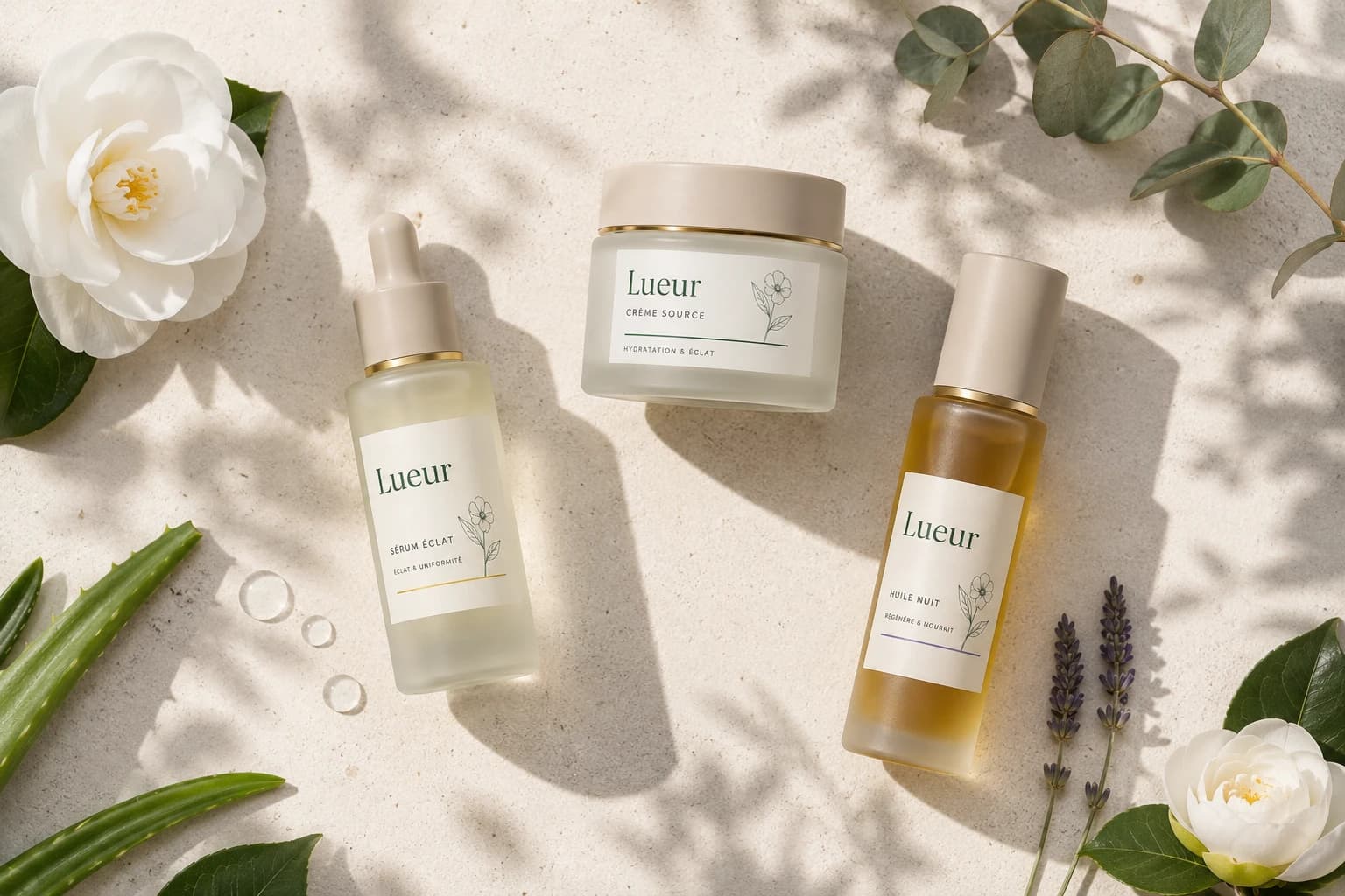
- The collection — a flat-lay of the range, then each product detailed (serum, cream, oil).
- The shopping journey — a drawer cart that slides in from the right, quantity management, a full checkout and an order confirmation with a number. All persistent, with no backend.
Stack & performance
- Astro in static rendering: no client-side JavaScript framework for display, just enough for the cart.
- Images automatically optimized to WebP, in several sizes depending on the screen.
- Scroll animations, mobile navigation, and care given to accessibility and contrast.
A demonstration project, but built with the same standards as a site delivered to a client: fast, clean, and thought through down to the smallest detail.
Next project
Sérein